How to make Codepen-like button with animated gradient border
Categorized as CSS
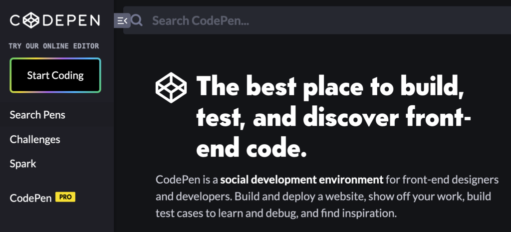
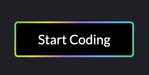
In previous post, we showed how to make gradient border with CSS. This time, we go a little bit further. Let’s take a look at the beautiful button “Start coding” on Codepen.io homepage (you have to be logged out to see it). It also animates beautifully on mouse over:
@import url("https://fonts.googleapis.com/css2?family=Lato");

html, body {
    font-family: 'Lato';
    background: #1e1f26;
    padding: 0;
    margin: 0;
}

* {
    box-sizing: border-box;
}

.button-anon-pen {
    width: 200px;
    background-image: linear-gradient(115deg, #4fcf70, #fad648, #a767e5, #12bcfe, #44ce7b);
    text-align: center;
    margin: 0 auto;
    position: relative;
    color: #fff;
    text-decoration: none;
    display: block;
    top: 45vh;
    font-weight: normal;
    border-radius: 6px;
    overflow: hidden;
}

.button-anon-pen:hover {
    -webkit-animation: play 1.6s ease-in infinite;
}

.button-anon-pen span {
    padding: 14px 0;
    font-size: 22px;
    display: block;
    margin: 3px;
    background: #000;
    border-radius: 3px;
}

@-webkit-keyframes play {
    0% {
        background-position: 0px;
    }
    20% {
        background-position: -110px;
    }
    35% {
        background-position: -180px;
    }
    50% {
        background-position: -210px;
    }
    80% {
        background-position: -350px;
    }
    100% {
        background-position: -390px;
    }
}
<a href="#" class="button-anon-pen">
<span>Start Coding</span>
</a>Here you are, beautiful button:
See Codepen.