How to use gradients for borders in CSS
Categorized as CSS
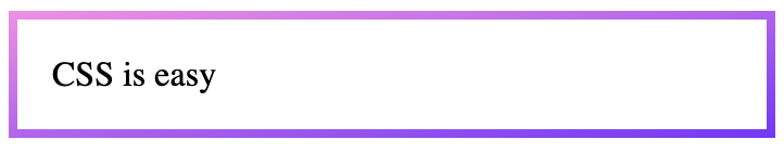
The border-image-source property allows you to set a trendy gradient for the element’s border.
div {
  padding: 1em;
}

.border {
  border: solid 4px;
  border-image-source: linear-gradient(to bottom right, #f78ae0, #6638f0);
  border-image-slice: 4;
}
<div class="border">
CSS is easy
</div>Try it on Codepen.
Remember, this code does not work with the border-radius property because it is not supported with border-image.
If you want to have rounded borders, you can try this code:
.border {
  position: relative;
}

.border::before {
  content: "";
  position: absolute;
  inset: 0;
  border-radius: 10px;
  padding: 6px;
  background:linear-gradient(to bottom right, #f78ae0, #6638f0);
  -webkit-mask:
     linear-gradient(#fff 0 0) content-box,
     linear-gradient(#fff 0 0);
  -webkit-mask-composite: xor;
          mask-composite: exclude;
}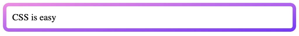
See Codepen